

How can SVT Barnplay give the user the best possible experience and offer of content already during the first visit, no matter if you are 3 or 12 years old?
Cooperation with SVT barn and teamwork with Helena Lindhe. Task to present concepts and improvements based on user needs.

The challenge
The challenge is the uncertainty about the visitors interest at the first visit in the SVT Barnplay.
Design thinking
To find innovative solutions for a better first experience, based on the hypotheses.

-

Target group
-

Prio Needs
-

Workshop
-

Interviews
-

Card Sorting
-

Insights from interviews
HOW MIGHT WE..
... create a relevant and positive experience for visitors who use the SVT Barn app for the first time.
... create a relevant experience for visitors who return regardless of age, ability or interest.
... create an inspiring and accessible experience when using the SVT Barn app.
Concept sketches
To find innovative solutions for a better first experience, based on the hypotheses.
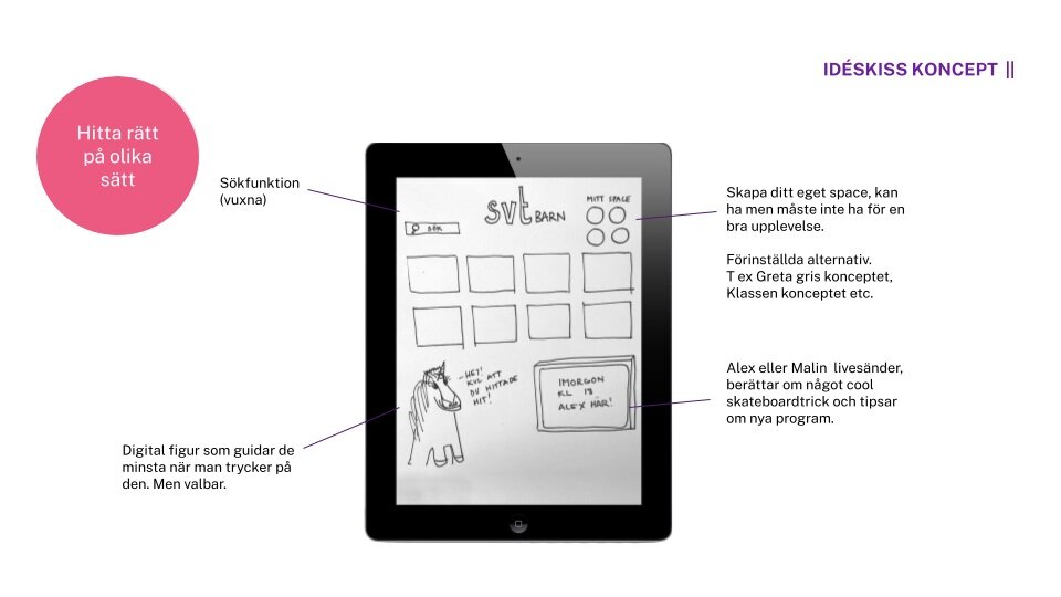
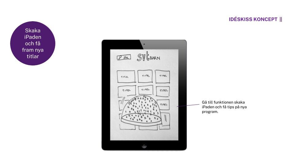
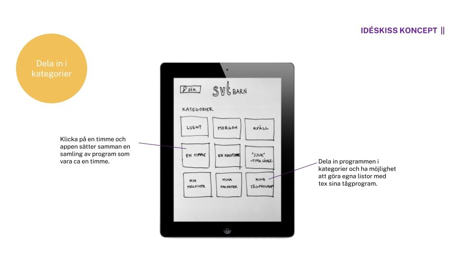
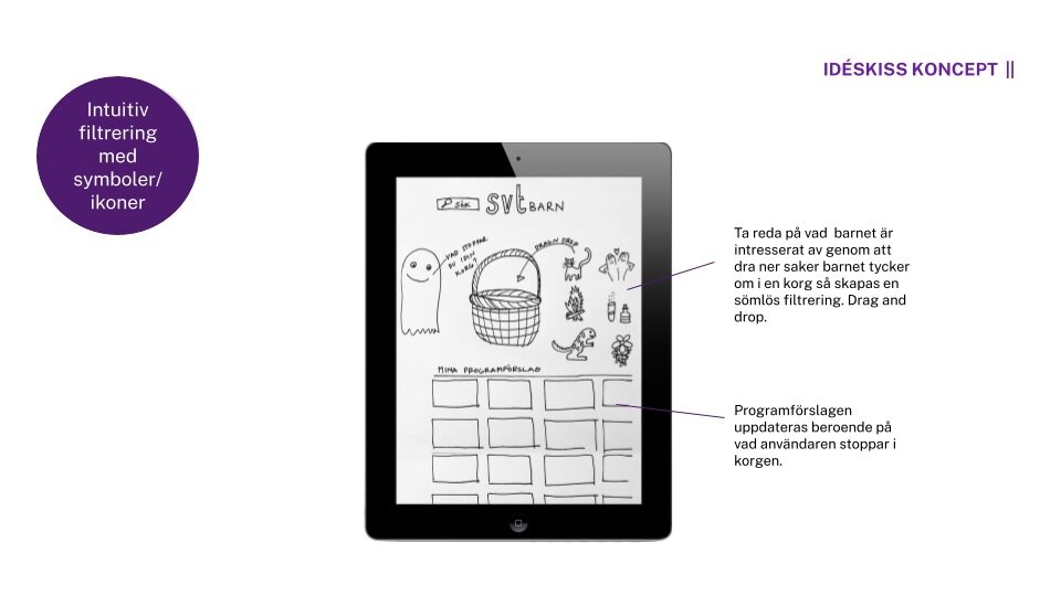
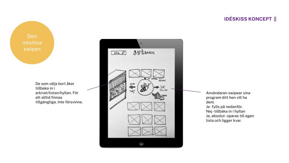
Concept presented as a rapid prototype
From the insights from the interviews and card sorting a rapid prototype was created to give an idea on how it could look. The proposal is conceptual and it’s intention is to be inspirational for the SVT barn app group on further improvements in the app for a better experience for the children, no matter age 3 or 12 years old.

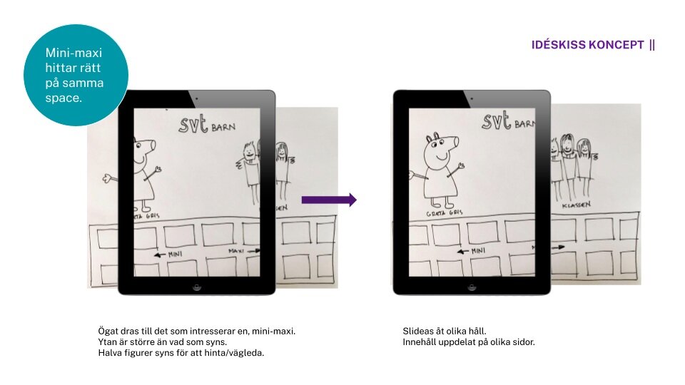
Pink for “mini” soft/kind - “Branded” purple in the middle on landing page - Black for “maxi”, cooler with cinema feeling.
It was clear that different users, wanted to find different titles. By using selective perception, where different sides was created to attract either mini or maxi, the users could use the same app but find the more relevant space for themselves within the app. By using colours and characters from the different titles that addresses different users mainly distinctive by age.
Pink was used for “mini” with a feeling of being soft and kind but still on of the branding colours. The landing page was “branded” purple in the middle where everyone start. The part to the right was black for “maxi”, with a feeling of being cooler and giving the vibe of a cinema.