Improving the SVT video on demand app for children by empathizing with users and evaluating concepts with rapid prototyping.
Module at Hyper Island.
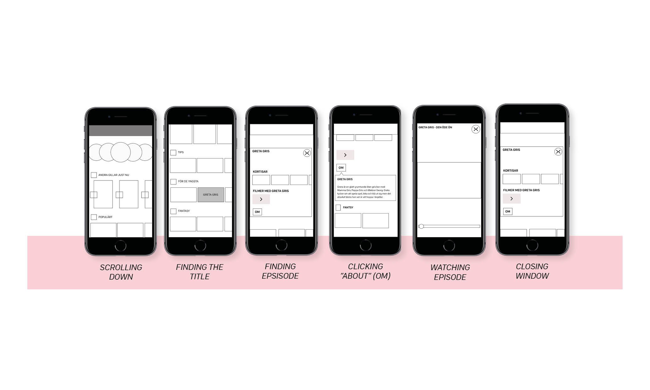
Empathize and understanding the user needs, put together in a storyboard.
What People Are Saying
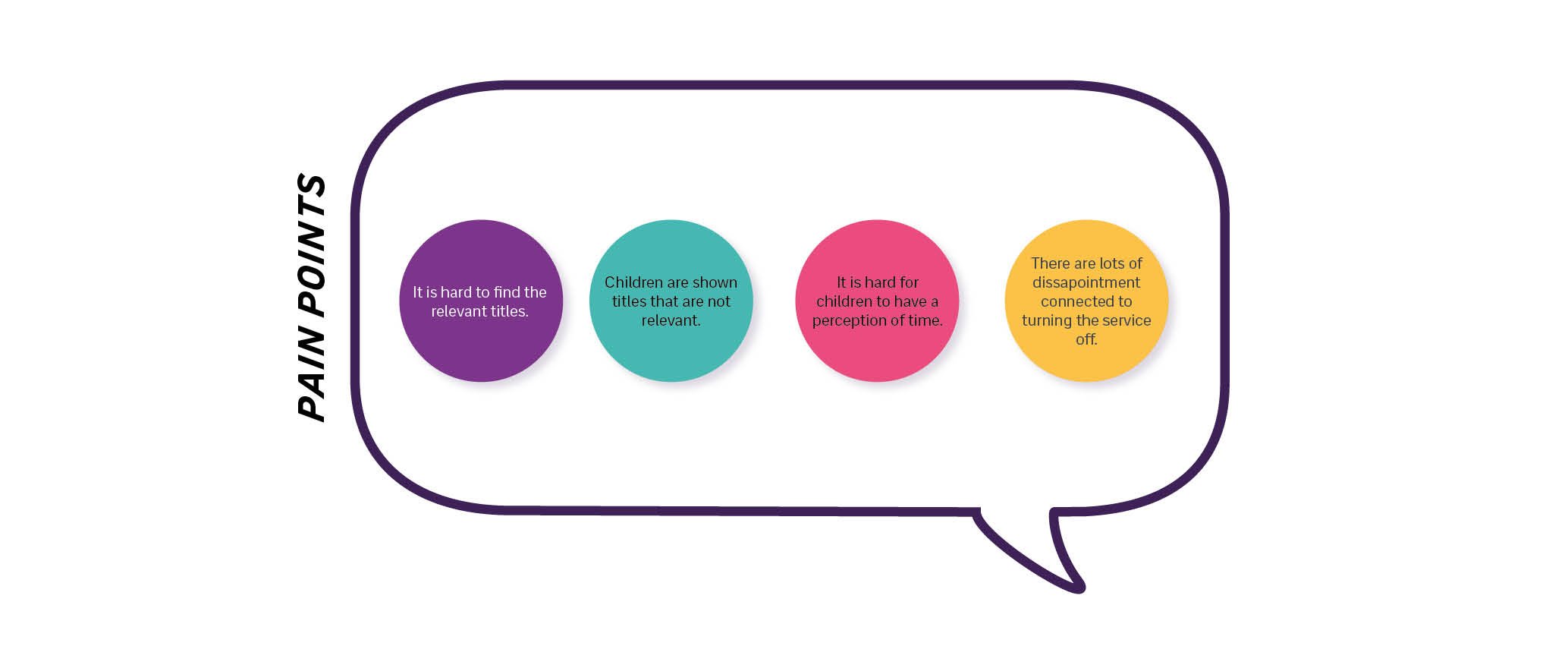
”There is certainly a lot of pictures to scroll through”
”I guess it is just to start scrolling?”
”Its is not that easy to find what I am looking for”
”It is overwhelming with all these titles.”
”Oh, I needed to start the episode before I could see how long it was”
”It is tough to let the kids know if they have time to watch it or not, after we have started to watch they don’t want to turn it off if too long”
User testing
The app is a video on demand app made for children 3-12 years. It is mainly based on visuals and the main thing is to find content/titles that one wants to watch. I choose to focus on the app being relevant and the experience around finding the right content and understanding it in relation to time.
The users were asked to find an episode of ”Peppa pig” and resonate about the length of the programs and about ”screentime” in different situations. Users was asked to ”think aloud” when clicking through the app.
When users found the episode they were looking for the length. Many clicked the about button.

Solution space
During the user testing it was clear that the users found it very monotonous with all the pictures/placeholders and there were an overwhelming amount of pictures that made them scroll a lot and hard to find what they were looking for.
The grid is made in 8 px. The height in between the rows are 40px and the space in between the titles are 8 px. It is made mobile first and since the app is supposed to be used by children the tapping areas are relatively big to minimize the risk for tapping outside the expected area.
The timer is added to address the length of the episode even in the main page.


